

COLOR
TYPOGRAPHY
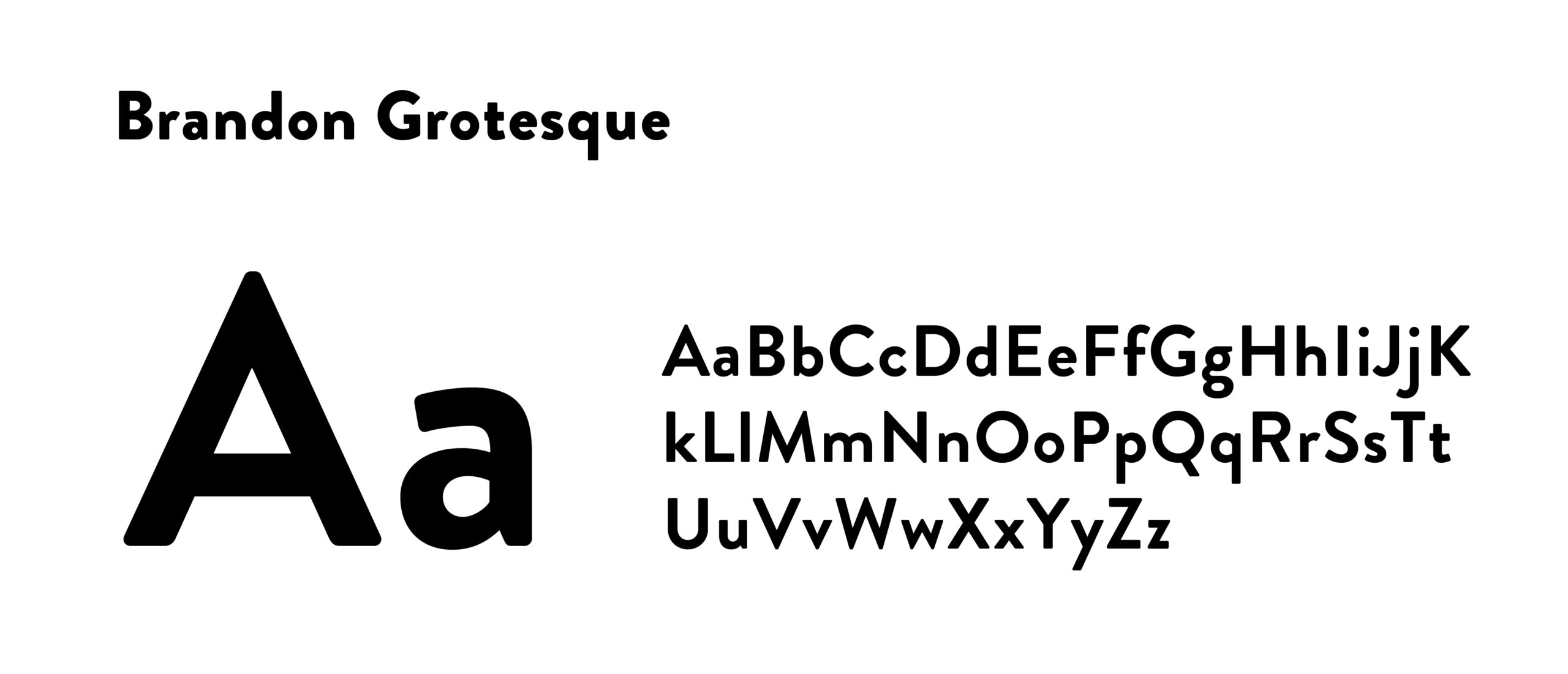
Brandon Grotesque is a clean, modern typeface that feels both approachable and refined. Its soft geometric forms give it a warm, welcoming personality while maintaining the clarity and versatility needed across both digital and print applications.
With a wide range of weights and styles, Brandon Grotesque works equally well for bold headlines, supporting copy, and branded communications. At Orangewood Church, Brandon Grotesque serves as the primary typeface and should be used as often as possible—especially for key, high-level communication.





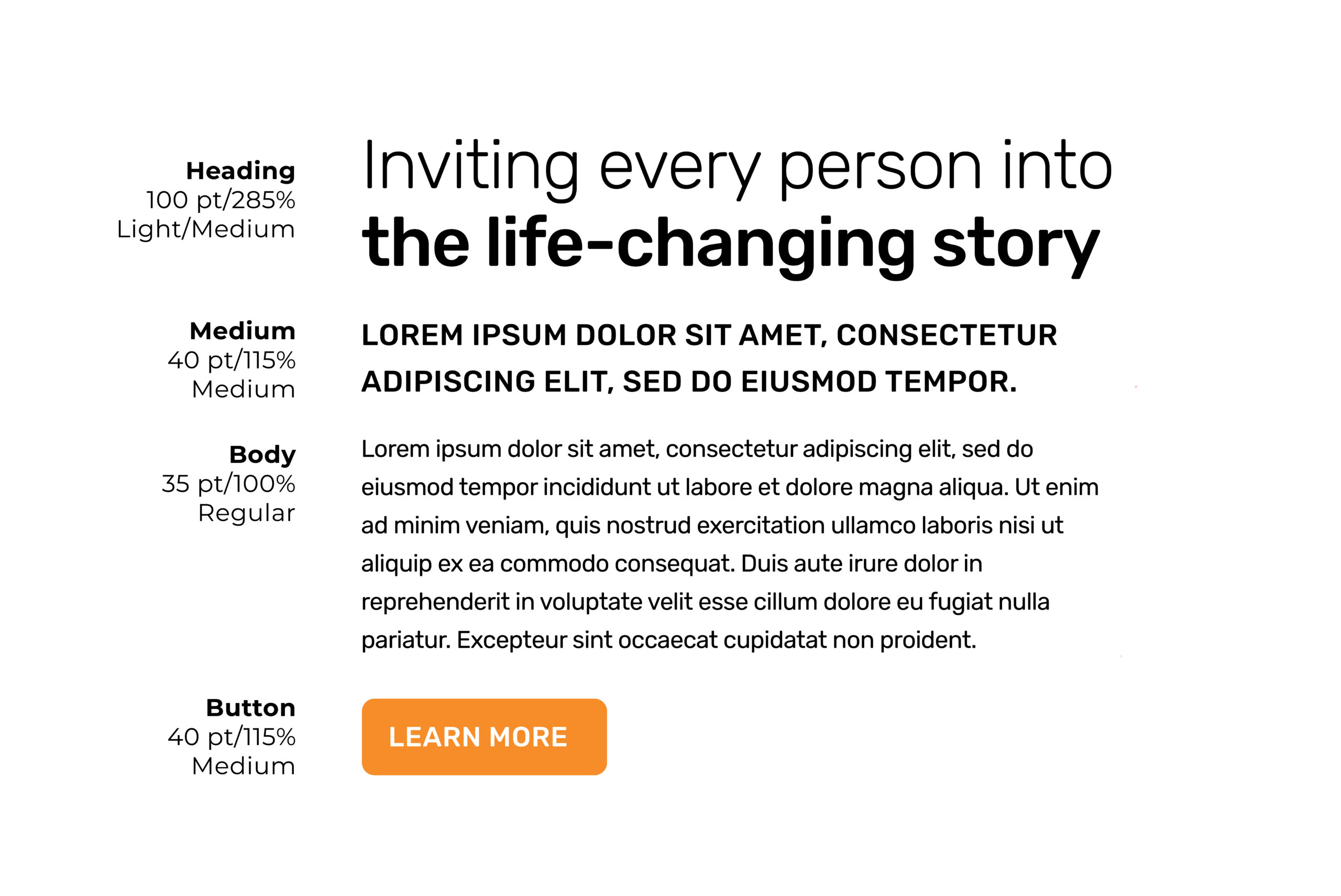
Our brand uses a strict typographic system—defining size, font, and layout—to create clear hierarchy and guide users to the most important information. Consistent use of this system ensures order, improves readability, and helps audiences quickly understand and navigate content.

WEB FONT
Rubik is a modern, approachable typeface that balances warmth with clarity, making it equally effective across digital and print applications.
Its rounded geometry gives it a friendly, accessible feel while still remaining clean and highly functional. As a free Google Font available in a wide range of weights and styles, Rubik is versatile enough for everything from bold headlines to longer-form body copy. At Orangewood, Rubik serves as the primary typeface and should be used whenever possible—especially for key, high-level communication.
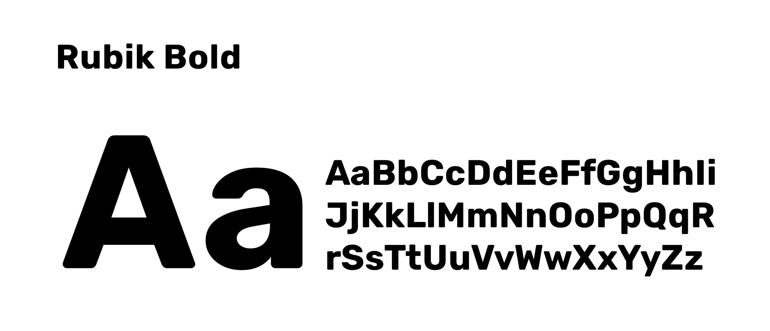
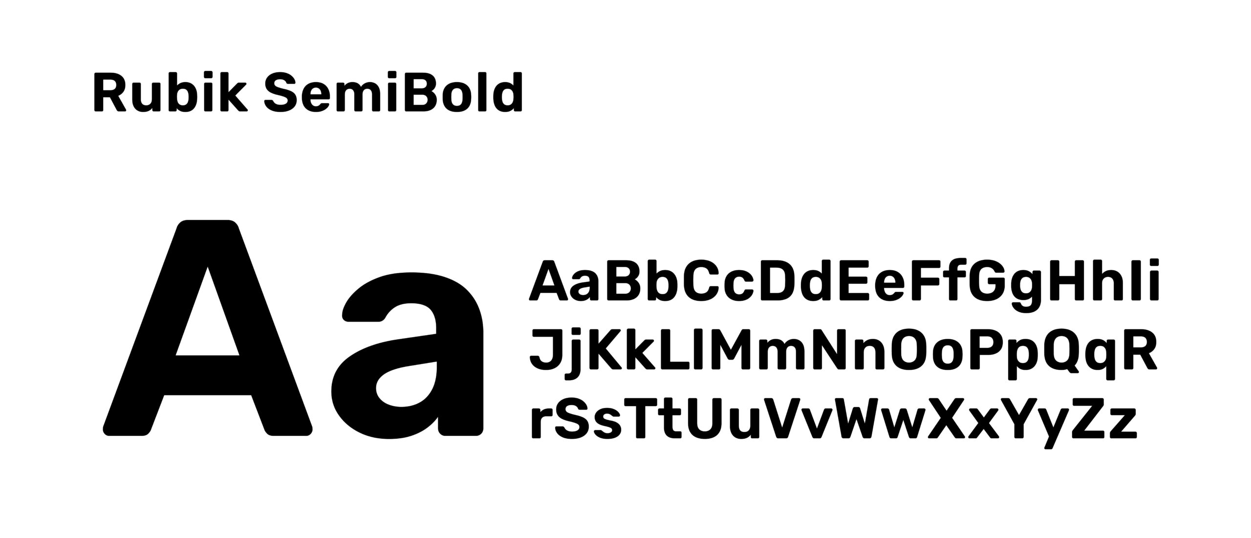
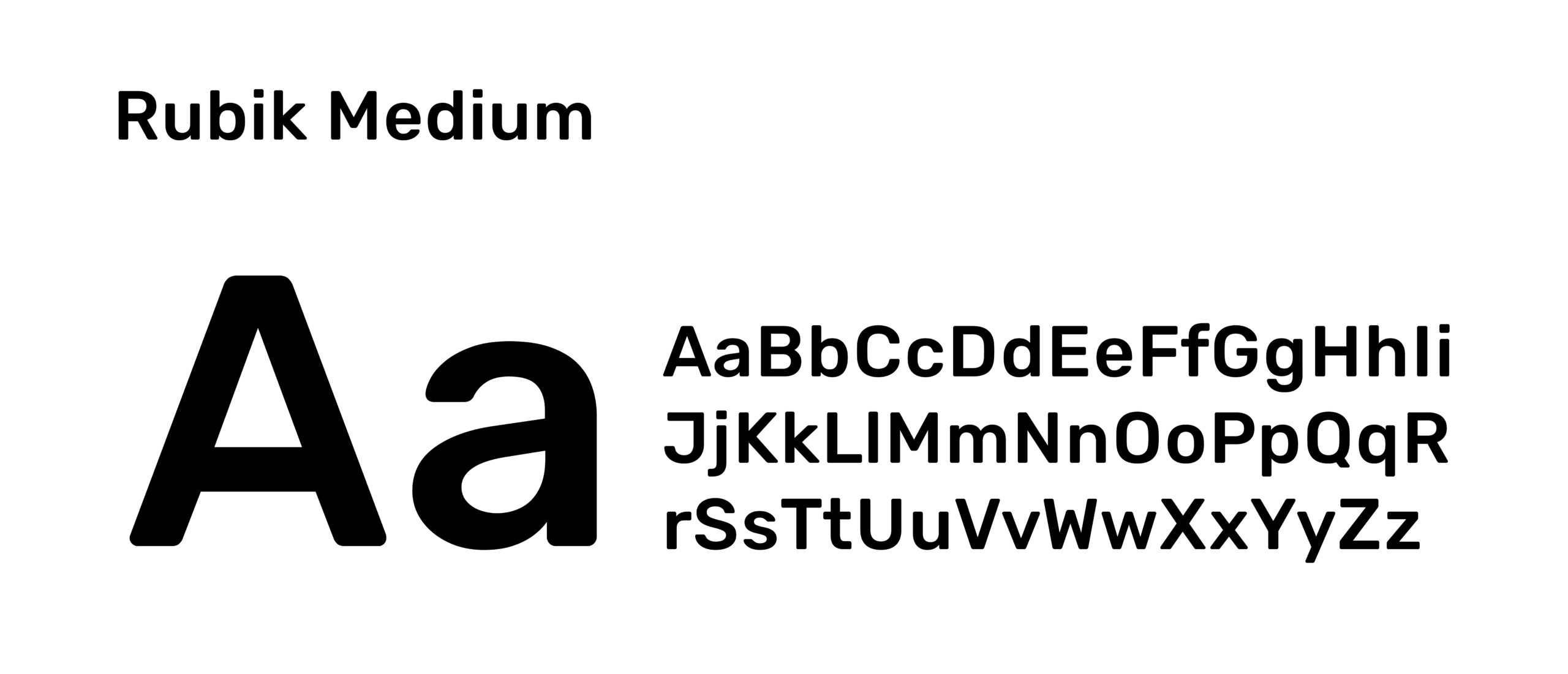
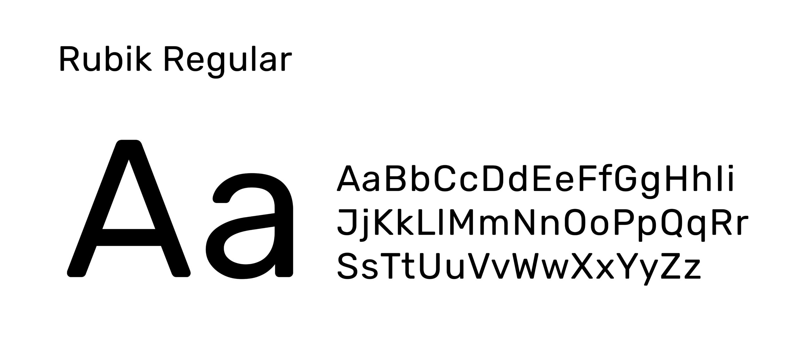
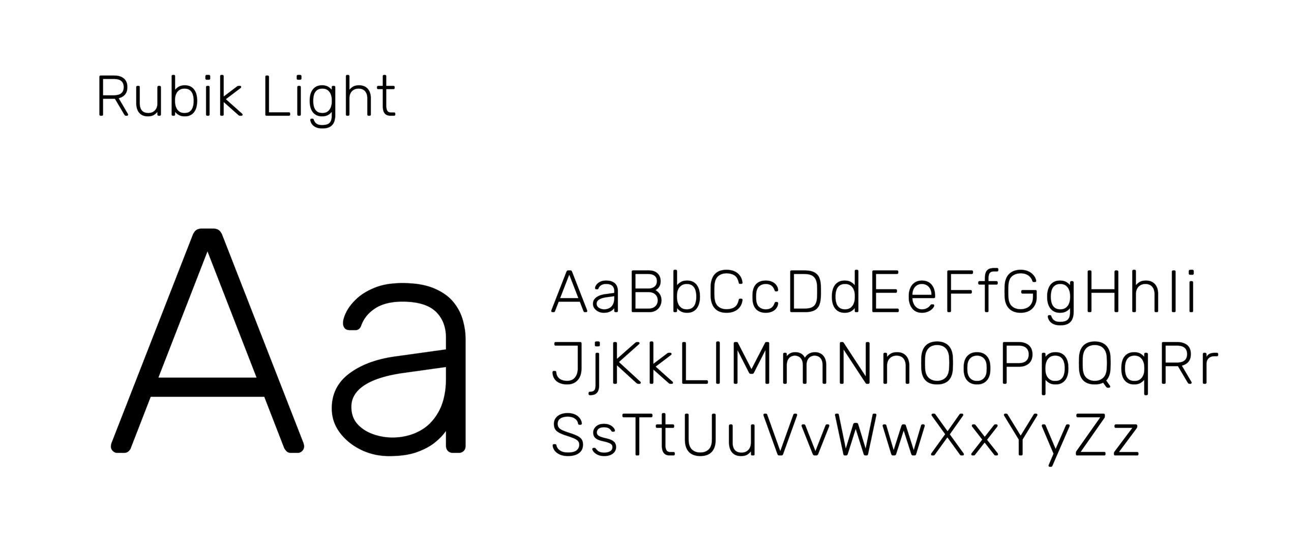
Our brand uses a strict typographic system—defining size, font, and layout—to create clear hierarchy and guide users to the most important information. Consistent use of this system ensures order, improves readability, and helps audiences quickly understand and navigate content.
PHOTOGRAPHY
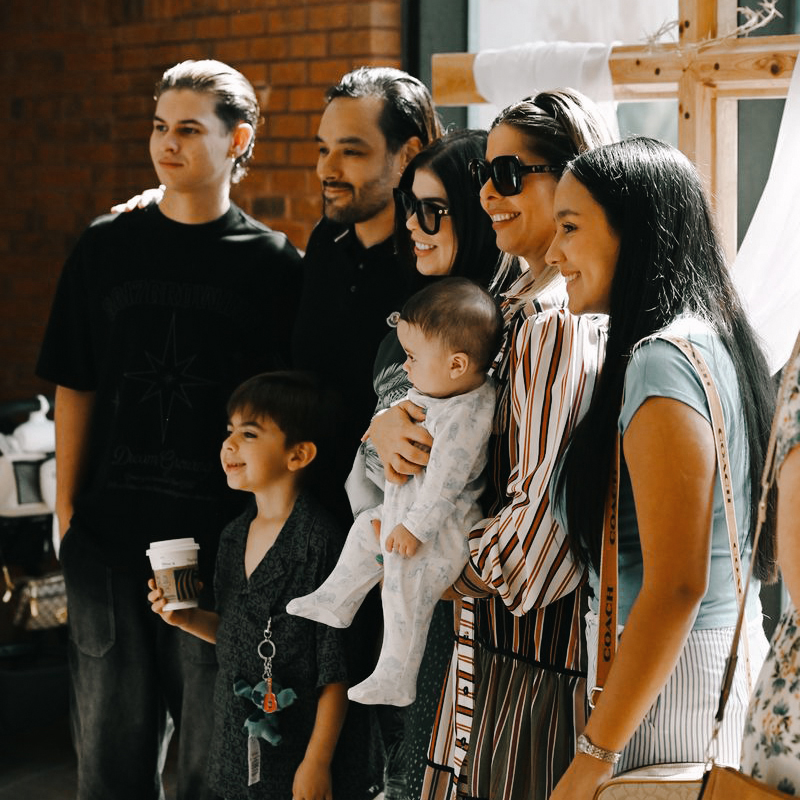
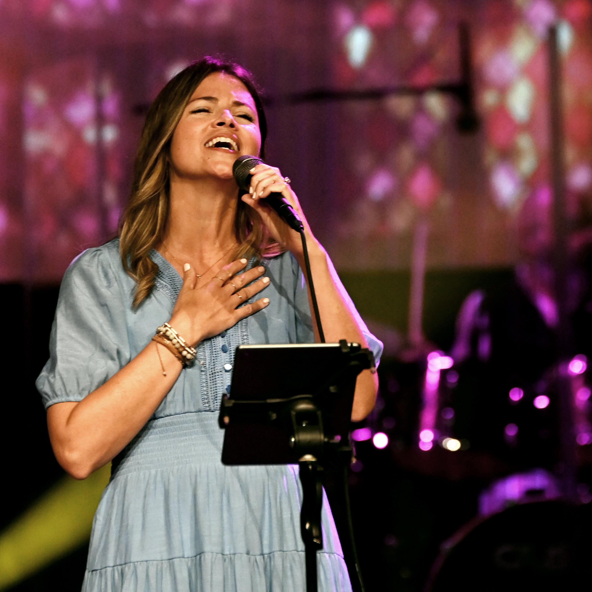
Prioritize Natural Light
Use natural light whenever possible. It creates warmth and authenticity. Avoid harsh flash or overly staged lighting.
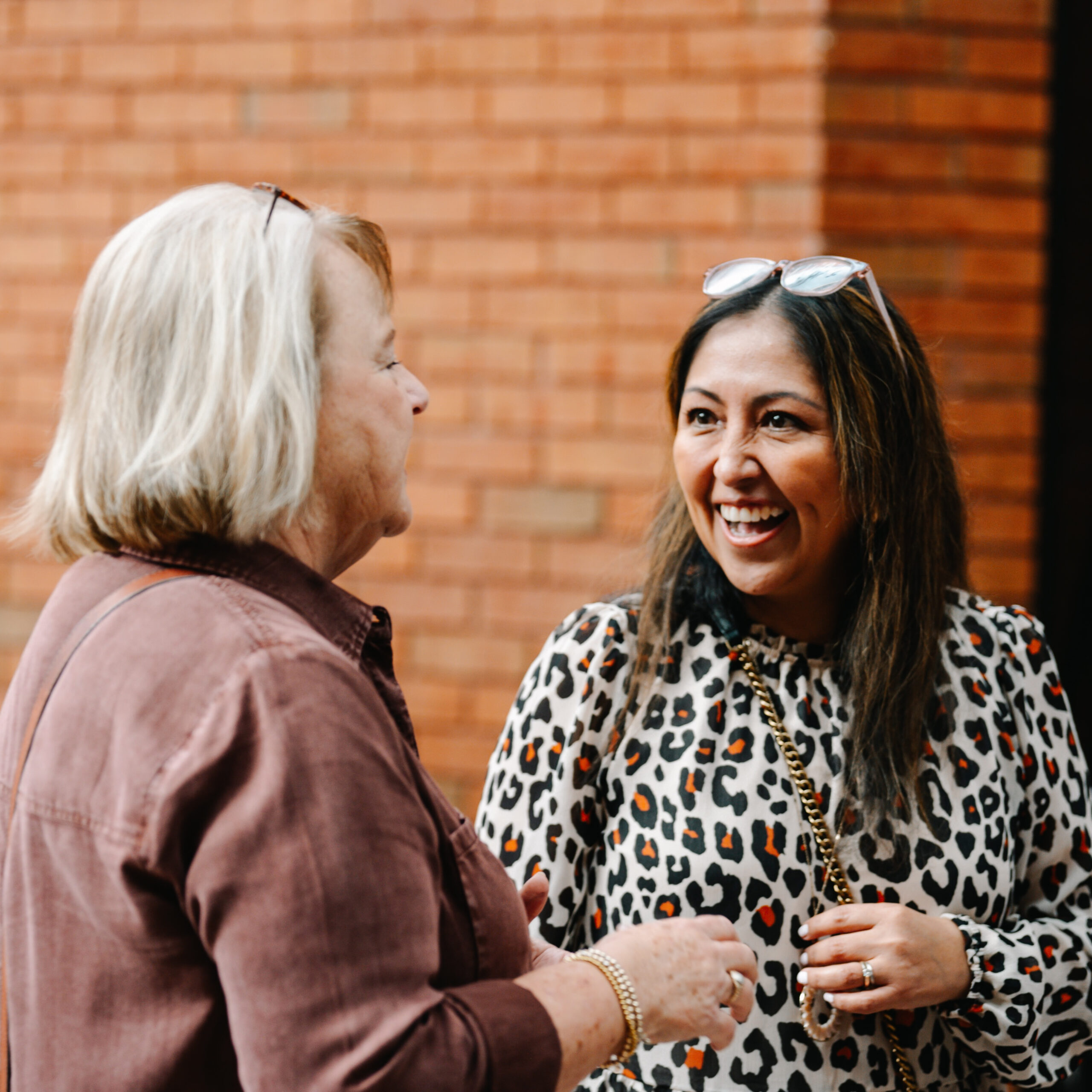
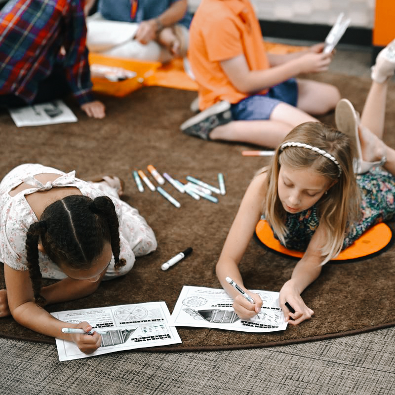
Capture Candid Over Posed
Focus on people engaged with each other, not looking at the camera. Real interaction over awareness of the lens.
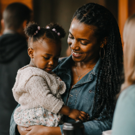
Real Moments Over Staged Scenes
Look for genuine emotion and connection. Light direction is fine, but the moment should feel unforced.
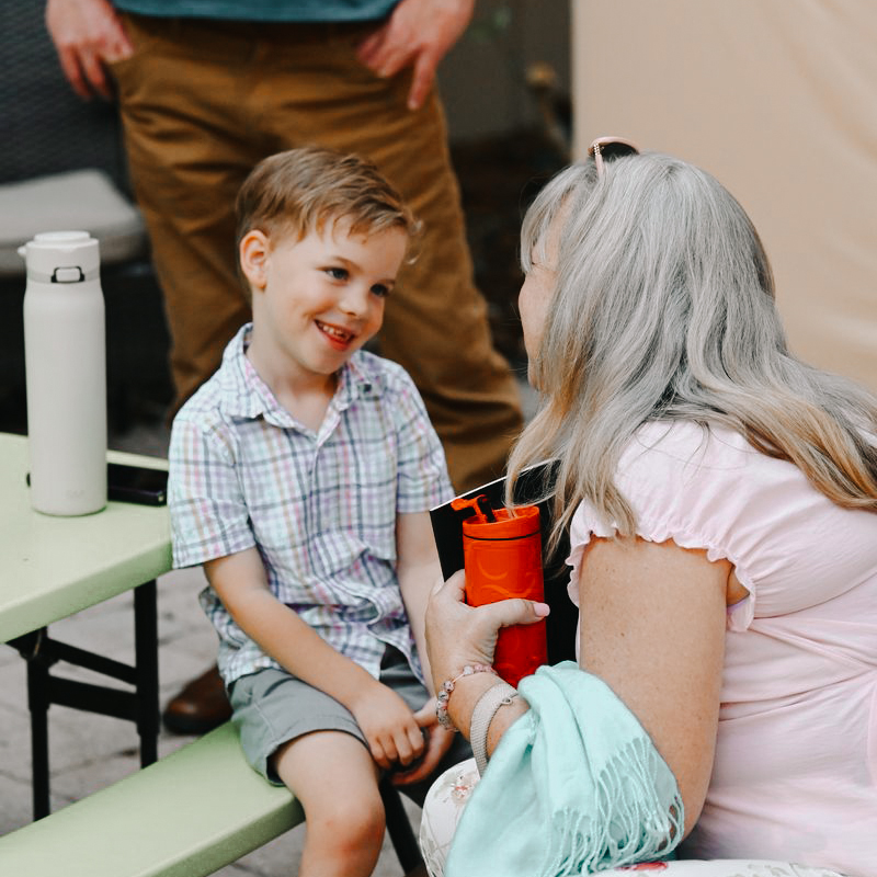
Use Brand Color Intentionally
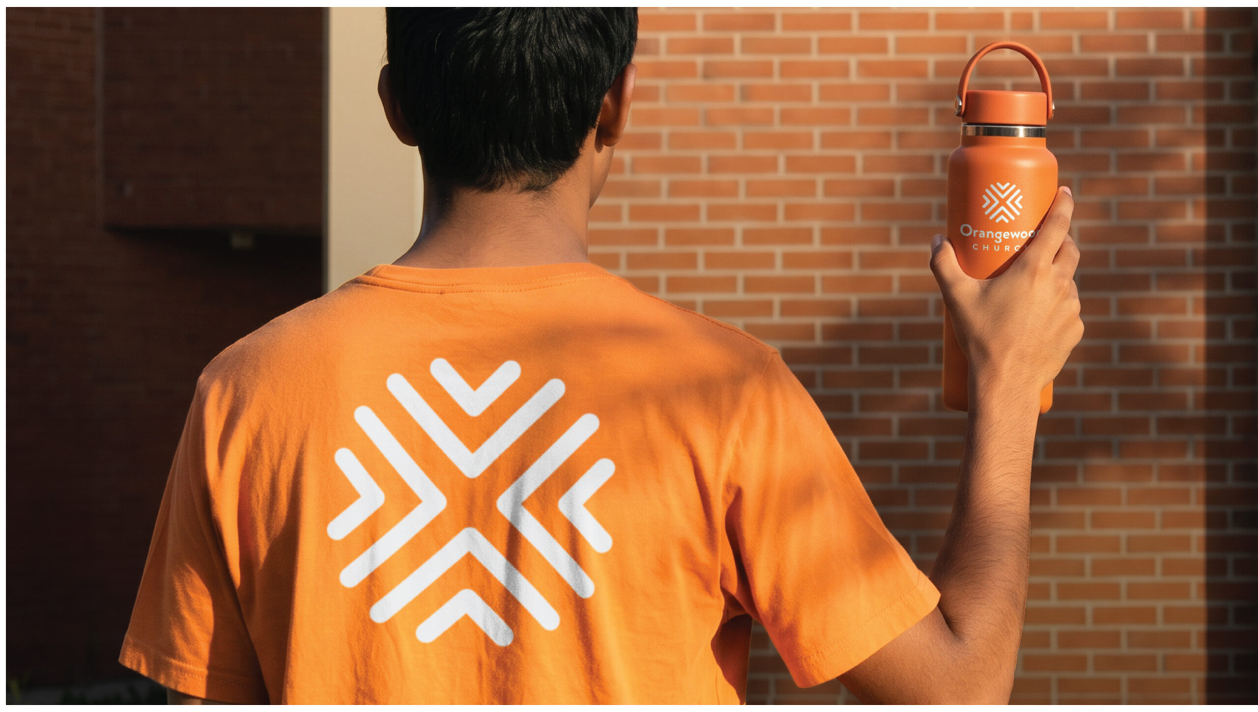
Incorporate subtle accents of our branded orange when possible. Keep it natural, not distracting.
Reflect the Full Picture of the Church
Show diversity across age, ethnicity, gender, and background. Representation should feel natural and inclusive.
Focus on Connection and Community
Highlight relationships and shared moments. Togetherness over individual portraits.
Keep It Approachable, Not Polished
Avoid overly perfect or over-edited images. Slight imperfections help it feel real.
AI or Editing Should Be Undetectable
Any editing or AI use should feel invisible. If it’s noticeable, it’s too much.
Color Grading
To keep color grading consistent across our naturally lit photos, use the provided LUT. It can be installed in Photoshop or other editing software and applied during editing. It brings up the orange tones, softens the light, and warms up the blacks.
Note: When applying the LUT to indoor photos, reduce the opacity by 20–30% to prevent skin tones from becoming overly orange.



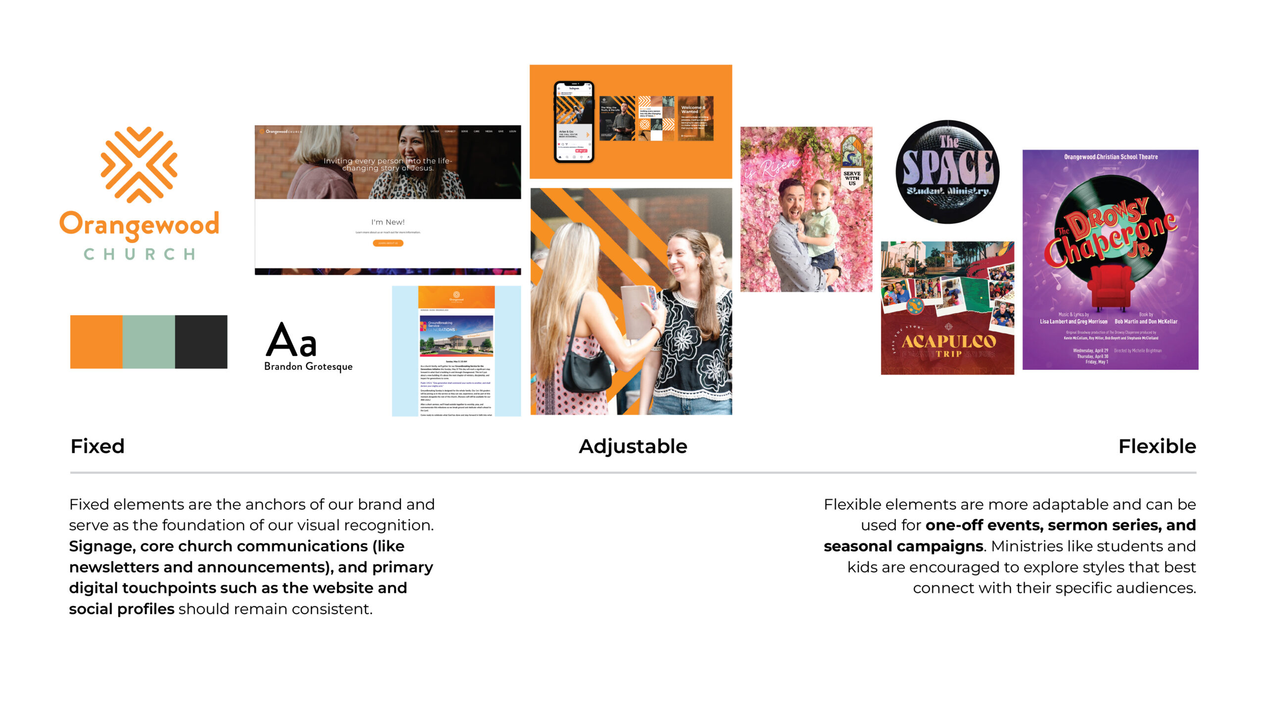
FIXED VS FLEXIBLE
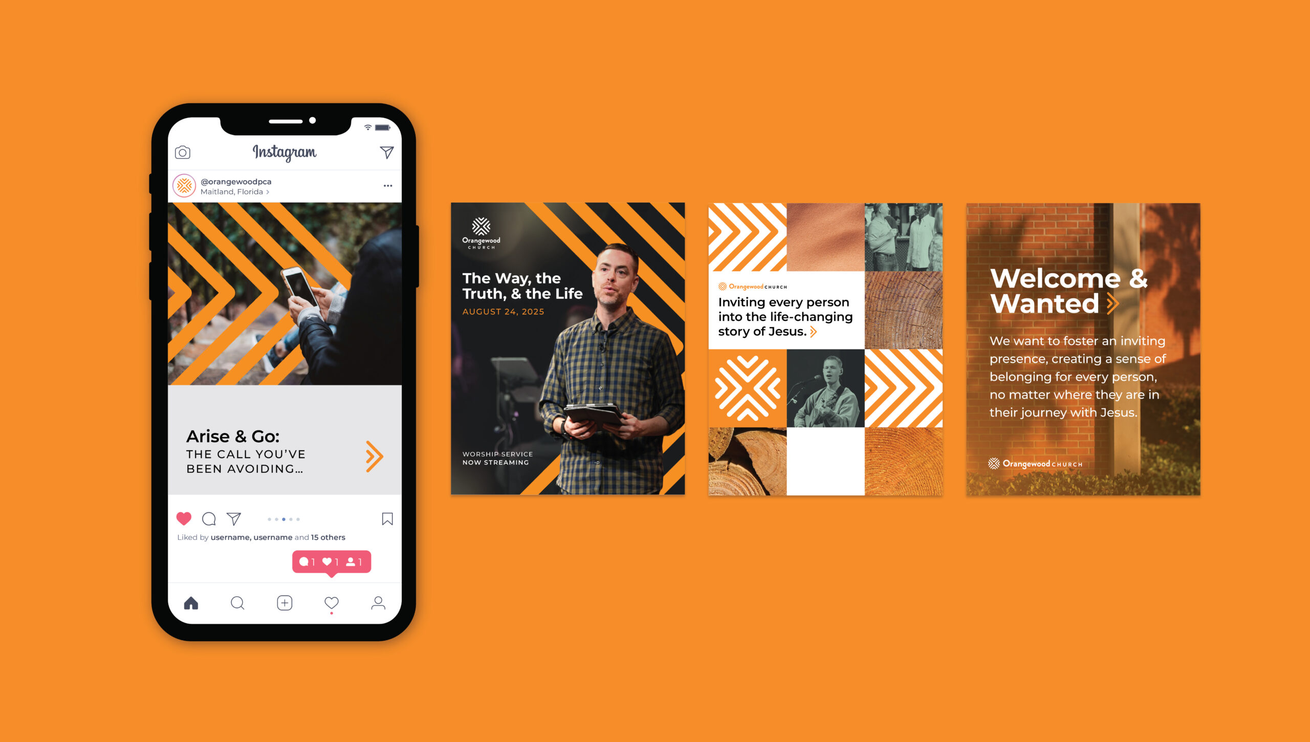
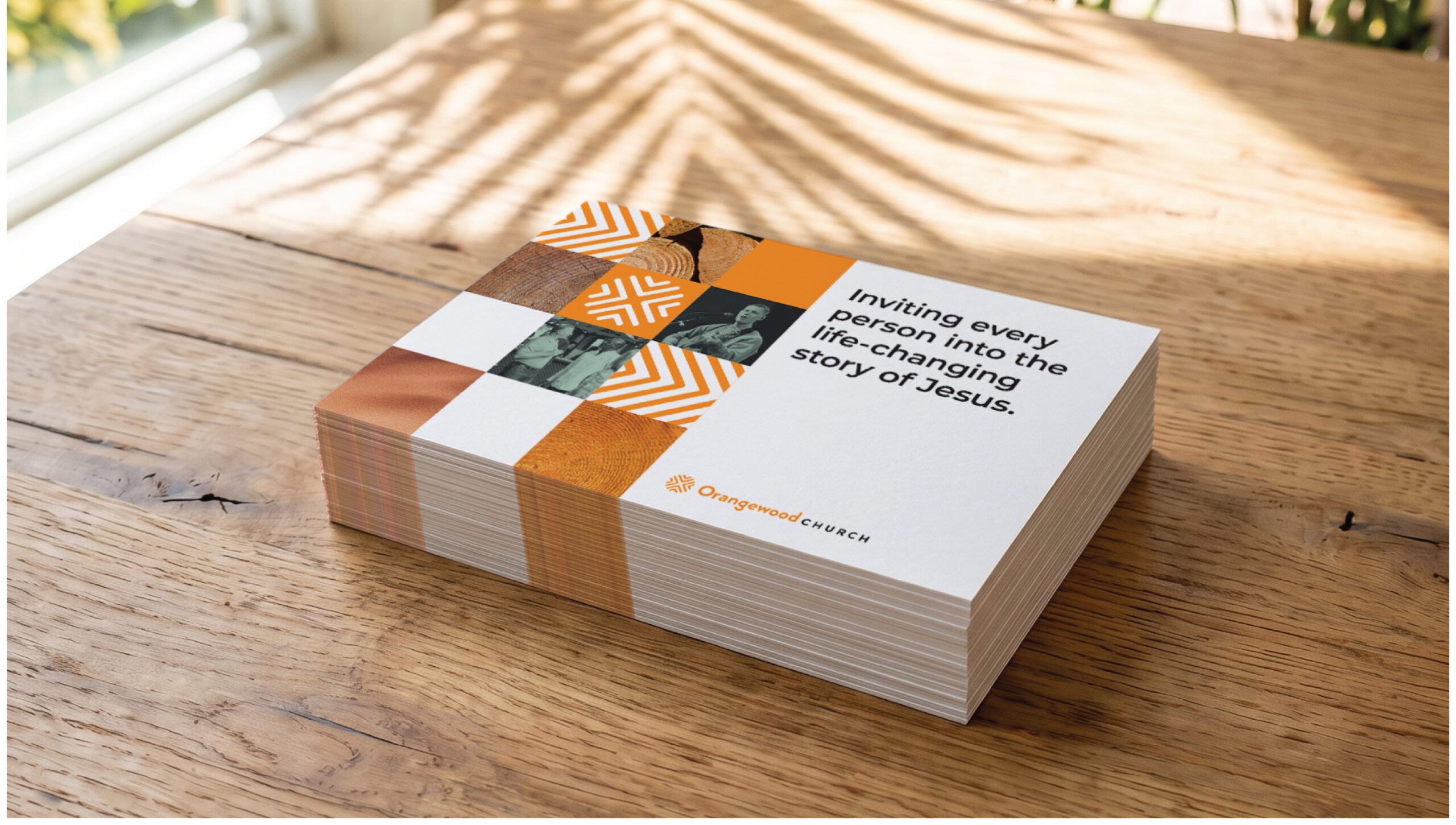
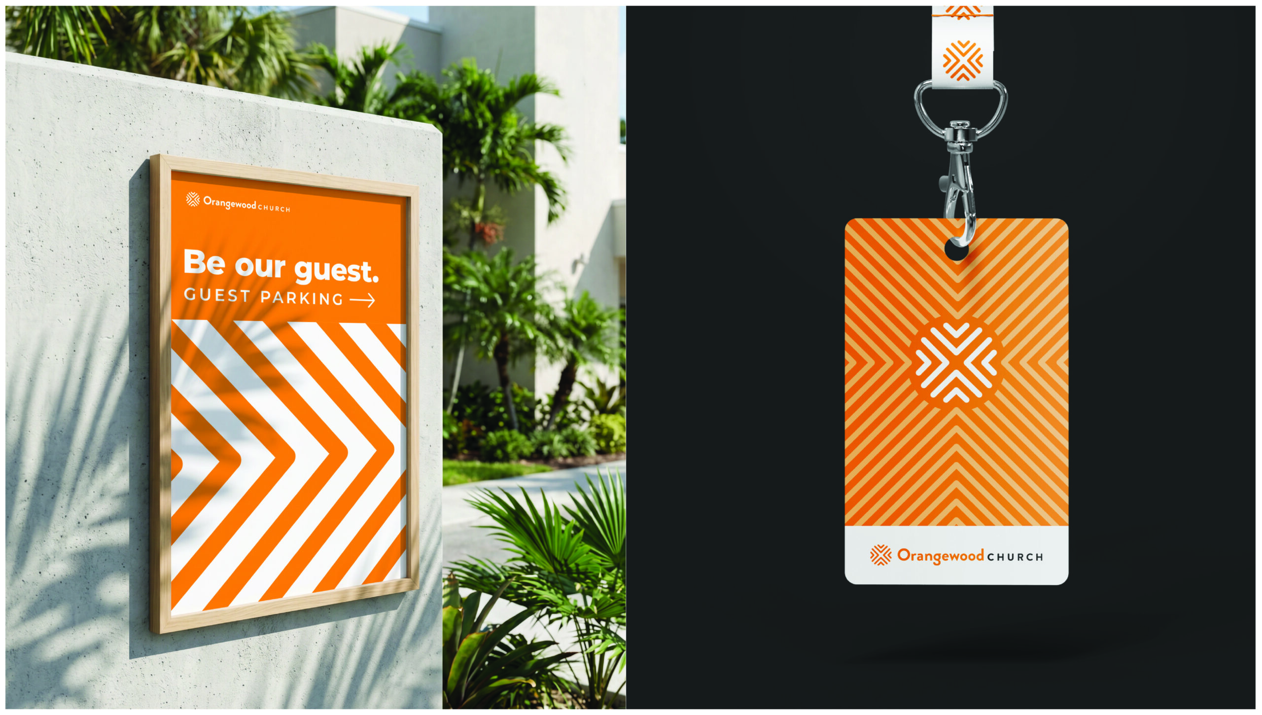
The inward-facing arrows are a direct reflection of our logo and can be used in squares, rectangles, and circles.

Single-direction arrows can act as directional signage or as graphic elements masked within images.

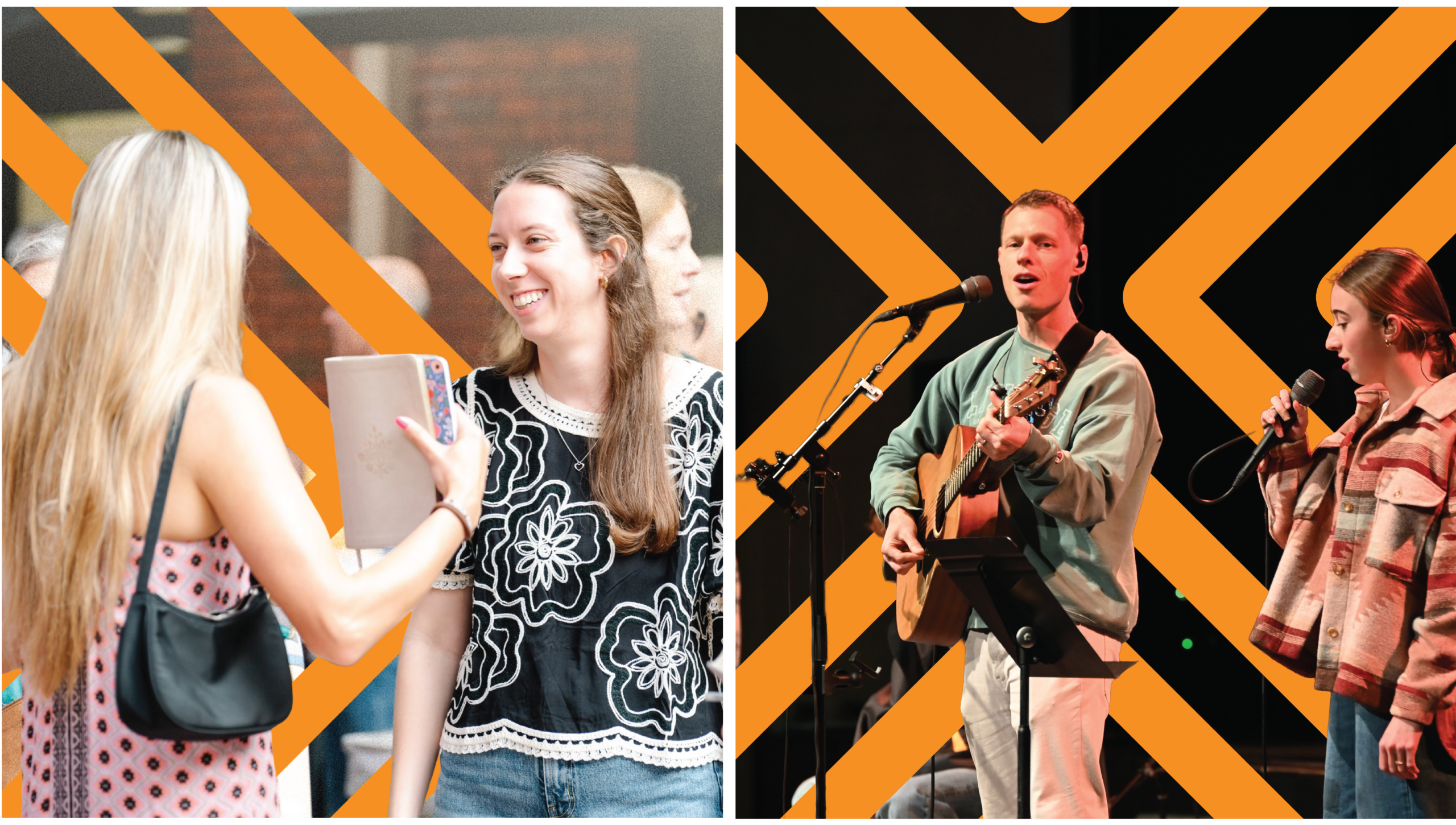

This means consistent use of typography, color, spacing, and imagery, as well as a clear alignment with our voice and values. Nothing should feel overly stylized, trend-driven, or disconnected. Instead, each piece of content should reinforce the brand’s identity, creating a cohesive experience across all touchpoints.
In practice, our social graphics and ads should feel just as intentional and grounded as our core brand materials—supporting the stories we tell while maintaining a unified and recognizable presence.